 •
•
A new decade is upon us, and as graphic designers continue their unending search for original ways to get their clients’ messages across, we are presented with the newest evolutions of design trends as we head into 2020. Some are very familiar (like the undying usage of outrageous, vibrant colors – which, not going to lie, I dig) and others are truly new and experimental.
Here are five graphic design trends for 2020 to help keep your brand looking fresh and up to date:
Those outrageously bright color schemes
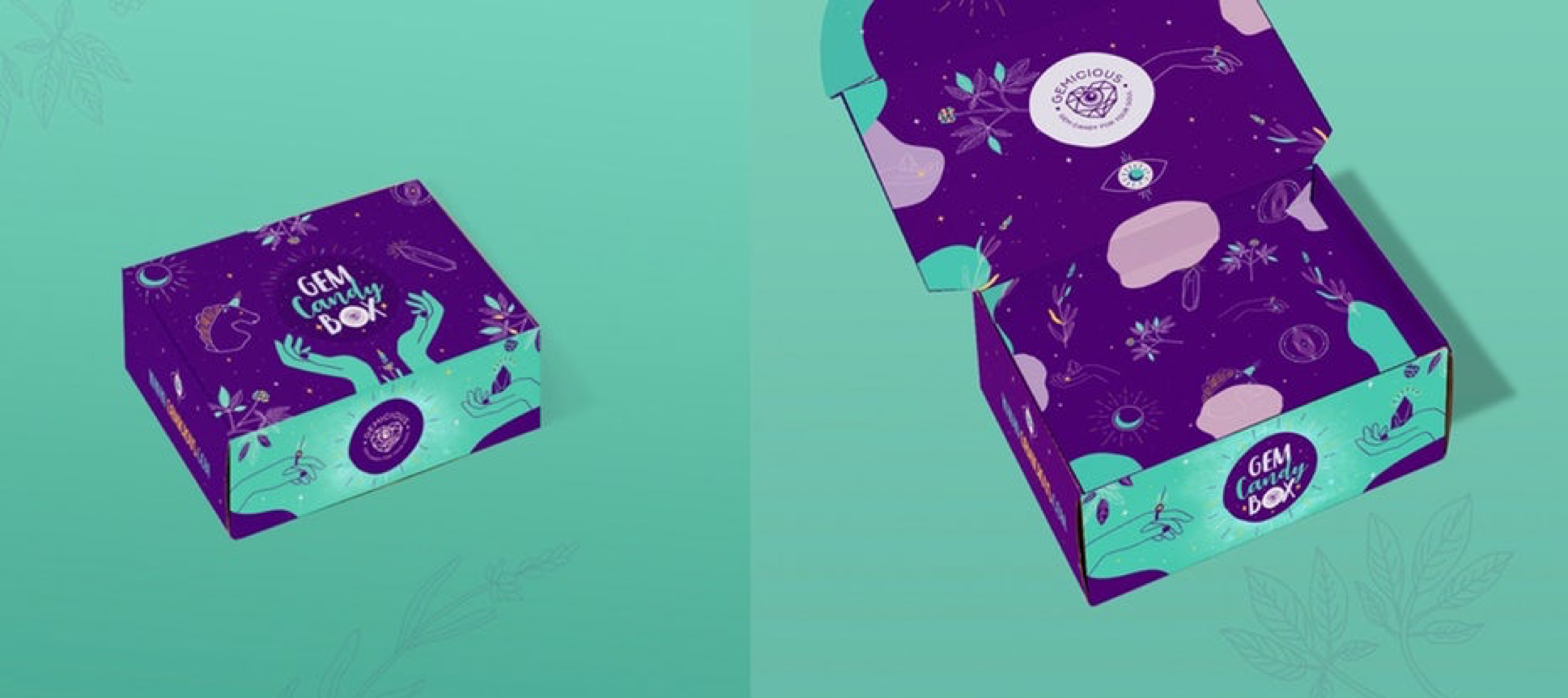
Many designers continue to use color schemes that are unnatural, vibrant and attention-grabbing. These schemes tend to convey a sense of fun and really draw your eye to the canvas. People don’t really experience these colors in real life – at least, we hope your vegetable garden isn’t a heavily saturated teal. So, designers continue to give people new experiences and draw out new emotions just by using unfamiliar colors in their ads. These color schemes have been around for at least a couple of years now, but, love ’em or hate ’em, they’re here to stay for a while longer.
Experimental typography
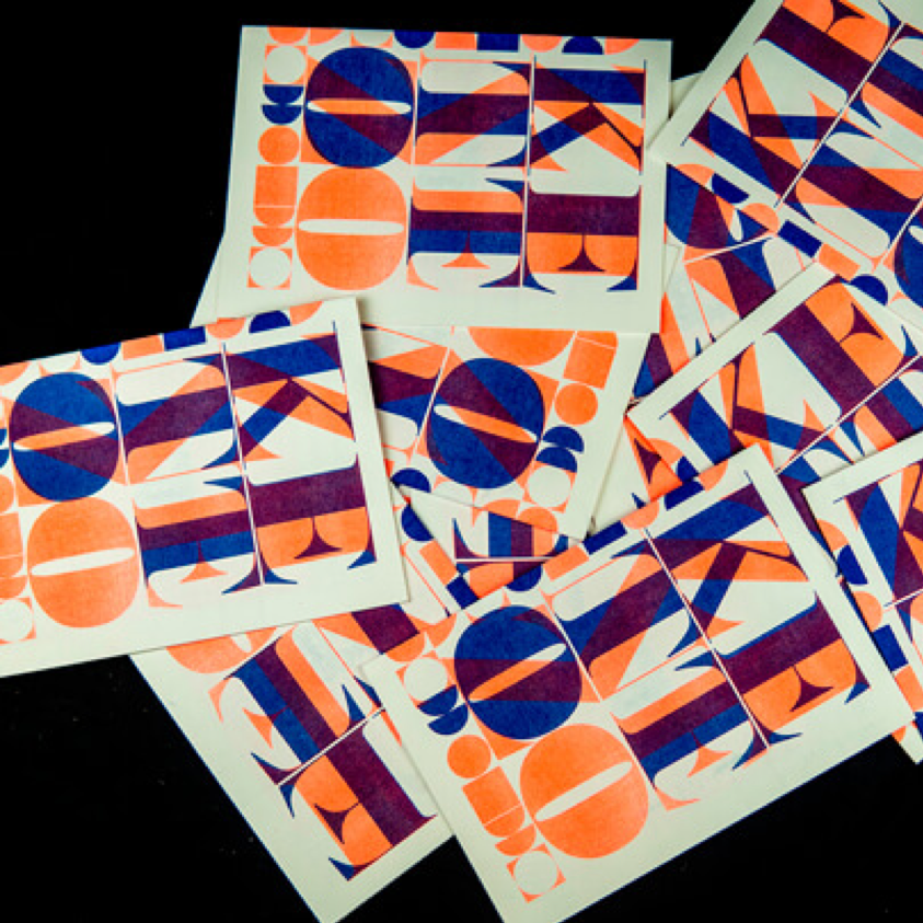
This is another aspect of design that has been circulating the industry for some time now, but I feel it is largely underutilized. The opportunity to implement such a design is rare because clients, creative directors or account managers are often reluctant to sacrifice clarity for a striking graphic. Of course, you’d almost never want to use such a technique on a billboard, but this experimental treatment of typography can be used strategically in other ways. For example, one could use these graphics as the attention-grabbers to lead the viewer into new content – like the cover to an ebook or as an image paired with a caption on social. You can set your brand apart from the rest simply because it is often a treatment companies avoid. Typography is creative in and of itself because most designs offer a strong visual as the primary aspect, and the choice of font for the copy that’s paired with the visual is often secondary.
Clipping images with text
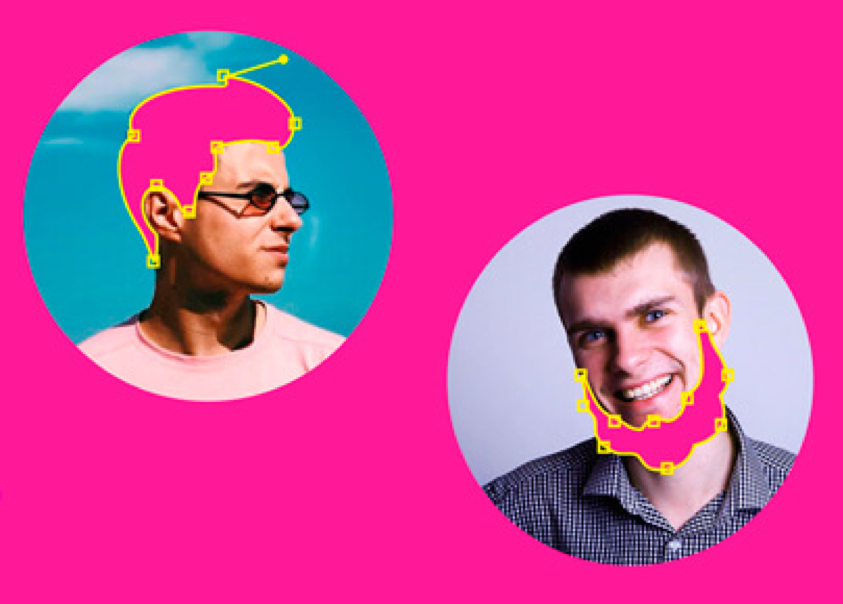
 Clipping masks in text are making a return. In past years, these weren’t used too often because they make text hard to read and the image inside hardly visible. However, as shown in the image above, designers are bringing them back by finding unique ways to intrigue viewers. The image is merely hinted in this example, causing the viewer to feel a bit of curiosity as to what the full image is and the story behind it. Rather than showing the image in its typical rectangular or circle-cropped format, text can add a bit of flair to the image without sacrificing the overall message.
Vintage modern
You’ve probably seen some companies temporarily switch their visual identity to that modern-vintage look where designers combine modern techniques with the type, shapes and colors of 1950s/1960s advertising. It’s one of my favorite looks. Now, designers are opening up the floodgates of the timeline of art.
All eras are up for grabs. In the image above, KisaDesign combines the modern minimalist style to the classical playing card and ends up with this logo. By reaching out to any era on the art history timeline, designers are granted infinite ways to twist the past into the modern world.
Combining images and illustrations
This is one of my favorite trends that I hope to implement into more of my designs in 2020. People often go for either A) photography-based visuals, or B) illustration-based visuals; however, designers are going for originality by asking: “Why not both?”
Designers are cleverly using illustrations to complement and highlight parts of the visual. It opens up the doors to a lot of experimentation, and experimentation often leads to new ways to pique viewers’ curiosity.
About The Author
With a past working in print shops, Marty now practices his true passions at ABC.
An accomplished musician with a penchant for pop culture, Marty now composes some of ABC’s finest print ads and digital media. He’s often the most creative guy in the room, throwing out ideas of various feasibility with a sharp wit that keeps the agency’s concept development meetings prolific.
His strong print background makes him ABC’s primary point of contact for the agency’s collateral projects and publications. Marty’s eye-catching layouts integrate great imagery and provocative typography that capture the essence of the creative team’s campaigns.
His impressive portfolio includes award-winning ads as well as many successful brochures, rack cards, infographics and e-communications for destination marketing projects.