 •
•
In the world of corporate branding, logos act as visual ambassadors, capturing the essence of a brand and leaving a lasting impression. Behind many iconic logos lie fascinating stories, interwoven with creativity, innovation and the pursuit of a distinct identity.
Delving into the histories of iconic logos often reveals captivating tales, including those of Nike, I Love NY and the indelible Chupa Chups. From the birth of the Nike Swoosh on a college campus to the surreal encounter that led to Salvador Dali’s masterpiece for Chupa Chups, each logo carries a unique history that has played a pivotal role in shaping the brands we recognize today.
Nike
The Nike Swoosh is one logo that speaks to the power of simplicity and meaningful design. The story behind this globally recognized symbol traces its origins back to 1971 when Carolyn Davidson, a graphic design student at Portland State University, played a pivotal role in shaping Nike’s visual identity.
At the time, Carolyn Davidson was pursuing a degree in graphic design, having initially started as a journalism major before discovering her passion for design in an elective course. It was during this period that she crossed paths with Phil Knight, who was teaching accounting classes at the university.
Knight, aware that Davidson needed extra funds to pursue oil painting classes, seized the opportunity to collaborate. He offered Davidson a freelance gig at his company, then known as Blue Ribbon Sports, which primarily imported running shoes from Japan. Knight was on the brink of launching his own line of shoes, though, and his new brand needed a distinctive logo, often referred to in the industry as a “stripe.” Knight approached Davidson for her design expertise, with a specific directive – to create a mark that conveyed motion and avoided any resemblance to the three stripes associated with Adidas.
Over the following weeks, Davidson diligently crafted several design options, each aimed at capturing the essence of the brand. She presented her creations to key figures at BRS, including Knight, Bob Woodell and Jeff Johnson. Among the options, one design caught their attention – the Swoosh – a simple yet dynamic shape inspired by the wings of the Greek goddess Nike, symbolizing movement, speed and victory.
In return for her creative contribution, Carolyn Davidson received a payment of $35 ($2 per hour for 17.5 hours of work).
Upon seeing the Swoosh, Knight expressed initial reservations, stating, “Well, I don’t love it, but maybe it will grow on me.” Despite Knight’s uncertainty, the decision was made, and the Swoosh became the chosen emblem for the brand. In return for her creative contribution, Carolyn Davidson received a payment of $35 ($2 per hour for 17.5 hours of work). Though the payment may seem low for the time spent and the impact the logo has had, Nike eventually recognized this. Davidson was invited to a company executive dinner in 1983, receiving a diamond-set ring with the Swoosh engraved on it, as well as company stock, the value of which has since tripled.
The Swoosh was officially trademarked on June 18, 1971, marking a crucial moment in Nike’s history. In June 1972, at the U.S. Track and Field Olympic Trials in Eugene, Oregon, Nike unveiled its first official track shoe – the Nike Cortez – featuring the newly-minted Swoosh. This marked the beginning of Nike’s ascent as a major player in the sports and athletic footwear industry.
Chupa Chups
In 1958, Spanish entrepreneur Enric Bernat revolutionized the lollipop industry with the creation of Chupa Chups. Frustrated by the messiness of traditional lollipops, he introduced the innovative idea of a lollipop with a stick, keeping children’s hands clean. Although the concept of lollipops existed since George Smith’s invention in 1908, Bernat’s hollow plastic sticks made a significant impact, propelling Chupa Chups to success.
To set his product apart, Bernat coined the playful and descriptive name “Chupa Chups,” derived from the Spanish verb “chupar” meaning “to suck.” With the brand gaining rapid popularity in the 1960s, Bernat recognized the need for an eye-catching logo. Seizing the opportunity, he approached Salvador Dali, a visionary artist known for his audacity and creativity, at a café in Barcelona.
Dali, intrigued by the challenge, agreed to design the logo. In less than an hour, he sketched his surrealistic vision on a napkin, creating a timeless piece of design history. The logo, featuring vibrant, swirling typography reminiscent of the lollipops themselves and Dali’s hypnotic paintings, also incorporated a daisy-like flower as a nod to the traditional Spanish children’s song “Debajo de un botón.”
In less than an hour, he sketched his surrealistic vision on a napkin, creating a timeless piece of design history.
Notably, Dali strategically placed the logo on top of the lollipop wrappers, a groundbreaking move at the time. Unlike other candies with logos hidden inside the wrapper, Dali ensured that Chupa Chups’ logo remained visible even during while the treat was being enjoyed, making the brand instantly recognizable and unforgettable.
Since its introduction in the 1960s, Salvador Dali’s Chupa Chups logo has undergone minimal changes, attesting to its timeless appeal and enduring impact. Today, Chupa Chups is a global phenomenon, sold in over 150 countries, with millions of lollipops produced daily. The brand’s success is not only attributed to its innovative product design but also to the enduring power of its iconic logo, which continues to captivate consumers worldwide.
I Love NY
The I Love NY logo, now an inseparable part of New York’s identity, emerged in the mid-1970s during a challenging period for the state. New York City grappled with soaring crime rates and financial distress, prompting the New York State government to initiate an advertising campaign to boost tourism and uplift spirits. The renowned advertising agency Wells Rich Greene conceived the campaign, centered around the powerful slogan “I Love New York.” To complete the campaign, a distinctive logo was needed, leading William S. Doyle, the deputy commissioner of commerce for New York state, to enlist the expertise of renowned designer Milton Glaser.
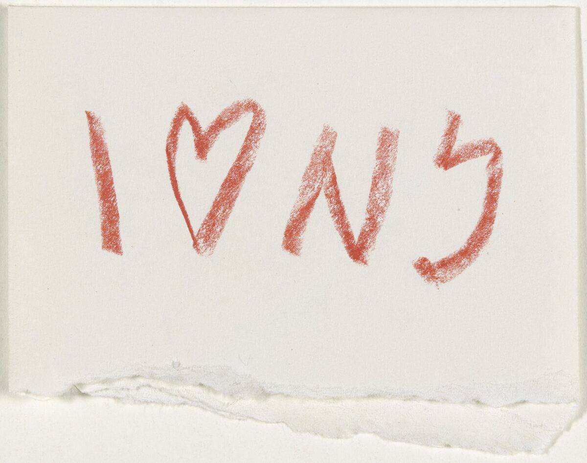
At the time, Glaser, already celebrated for his work with Push Pin Studios, including iconic designs for Bob Dylan’s Greatest Hits album and New York magazine, was running his own studio. In 1975 (according to Glaser, though other sources cite 1977), he took on the task of creating the logo, spending about a week on its initial design. The concept, as Glaser described in his book “Art Is Work,” required a visual equivalent for the powerful slogan. His first typographic solution was swiftly approved, but Glaser, in a spur-of-the-moment inspiration, presented an alternative idea on the back of an envelope while in a cab.
Despite the initial reluctance of Doyle due to the complexities of securing approvals, Glaser’s second design gained approval after a meeting. Remarkably, Glaser provided his services pro bono, driven by a desire to contribute to the city’s resurgence. Reflecting on the design process, Glaser admits that the logo, now globally recognized, was conceived in about ten seconds, drawing inspiration from memories of lover’s initials carved into tree trunks.
The font choice, a variation of American Typewriter, was deliberate, combining informality, literary reference and a rigid counterpoint to the voluptuous heart. Glaser expresses surprise at the logo’s enduring impact and its ability to persistently resonate with people. “No one could have had any idea how significant the logo would become, certainly not me,” he reflects, emphasizing the unexpected longevity and continued effectiveness of the I Love NY logo. It remains a symbol of the power of design in encapsulating the spirit of a city and enduring through the decades.
“No one could have had any idea how significant the logo would become, certainly not me,” he reflects, emphasizing the unexpected longevity and continued effectiveness of the I Love NY logo.
As our exploration of the stories behind these iconic logos comes to an end, it becomes clear that these designs are more than just visuals; they’re storytellers. The Nike Swoosh, born from a collaboration between student and entrepreneur; the I Love NY logo, a beacon of hope amidst adversity; and Salvador Dali’s Chupa Chups masterpiece, a blend of playfulness and sophistication. These tales remind us that a logo is not just a picture but a reflection of a brand’s essence, values and enduring legacy. In the ever-changing world of corporate identity, these logos are great examples of the artistry and innovation that define branding.
About The Author
Sean brings a true passion for all things design to ABC. He elevates his expertise in typography, color and texture in every piece he creates for clients.
He has a varied background that has earned him managerial and senior status in previous positions. As a member of the ABC team, the Rochester Institute of Technology grad is our go-to for projects of all kinds and sizes as we entrust his expert eye with everything from print pieces to digital design.
Sean was drawn to working with a close, collaborative group of people that are passionate and full of great ideas when he decided to join ABC.