 •
•
For whatever reason, you have decided to have a new logo created. Maybe you are starting a new business, maybe you are sick of the one you have, or maybe the new boss just doesn’t like the old one. This will not be an easy task.

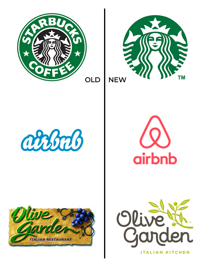
If you are starting a new business, then this means the world to you. It will literally be the face of your new venture and you will obsess and lose sleep trying to pick that face. If you are just sick of the old one, it gets a little easier, but you have to determine how radical your changes will be. Are you completely dismantling the old one and going for a whole new fresh look? Or maybe you just want to modernize the one you have like some of these famous brands. And if you are being tasked by the boss or even worse, a committee of people, then good luck.
After decades of rebrands, new logos and being a part of all of these scenarios, I can run you through my process and hopefully it will get you a new logo a little quicker.
A Little Research Helps
Most likely you have asked an agency, graphic designer or maybe an illustrator to help you with this project. Most people do not have the skills or ability to develop a logo on their own and, even more importantly, make sure you develop it while considering all the different formats and forms this may take in the future. So, do some research. Send your faithful design partners some logos you like or even hate. A skilled artist will be able to see some trends in the logos you share that will help them determine a direction to go in.
Understand The Styles
There are all kinds of different logo styles to consider. These all have fancy designer names that will actually mean something to the person developing the logo for you. Learning how to speak their language can help you along in the process. WARNING: Do not say things like “I just want it to POP.” You may lose your designer. This is a cool little write-up that may help.
Expect A Lot
We design a ton of logos to start. Our clients may not see all of them, but we start by creating a ton. Many of them are very similar with maybe just some minor tweaks to the elements or fonts giving a lot of variation. We review them with a bunch of creatives and sometimes just some outside eyes to get a gut reaction. We go back with the feedback make some tweaks and still deliver a lot, sometimes too many, to choose from. So, expect some choices and some variety. At this phase of the process, we are just trying to get a better feel of what the client likes and doesn’t like. It narrows it down a little more.
WARNING: Do not say things like “I just want it to POP.” You may lose your designer.
Ignore The Colors
Our first go around and even the second set of the logos we share after client feedback are still all black and gray. This helps you just look at the logo itself and not get swayed or turned off by a color you may love or hate. Typically, the color palette is determined by other factors such as the industry you are in, what the competitors are using or maybe just what you like. So don’t worry we can usually narrow down the colors a bit before we get to that part.
It Gets Hard
So now you have probably narrowed it down to a few logos in the black and gray versions and the designers have provided those to you in various color schemes. The good designers have also given you a vertical and horizontal version and what it would look like reversed out of a solid color. But you still must make that decision. Don’t be afraid to ask for another tweak or two but don’t get crazy, your gut got you this far, you’re so close. Unless you are that person who is working for a committee or board like I mentioned earlier. If you are that person, by this point you are probably on your 12th set of revisions. Sorry.
Don’t be afraid to ask for another tweak or two but don’t get crazy, your gut got you this far, you’re so close.
Show It Off
I’m not going to lie. One of the worst things a designer wants to hear is “I took this home to my spouse and asked them what they thought, and they have some thoughts”. Out rolls the three-page document. But, I recommend showing the logos that you have narrowed down to your very favorites to some other folks. Just get their gut reaction. What stands out? Don’t stare at them and let them pick them apart – anyone can do that – just get their first honest reaction. Maybe even let a group do a little vote for their favorite. If anything, this may just solidify your first choice.
Chill Out
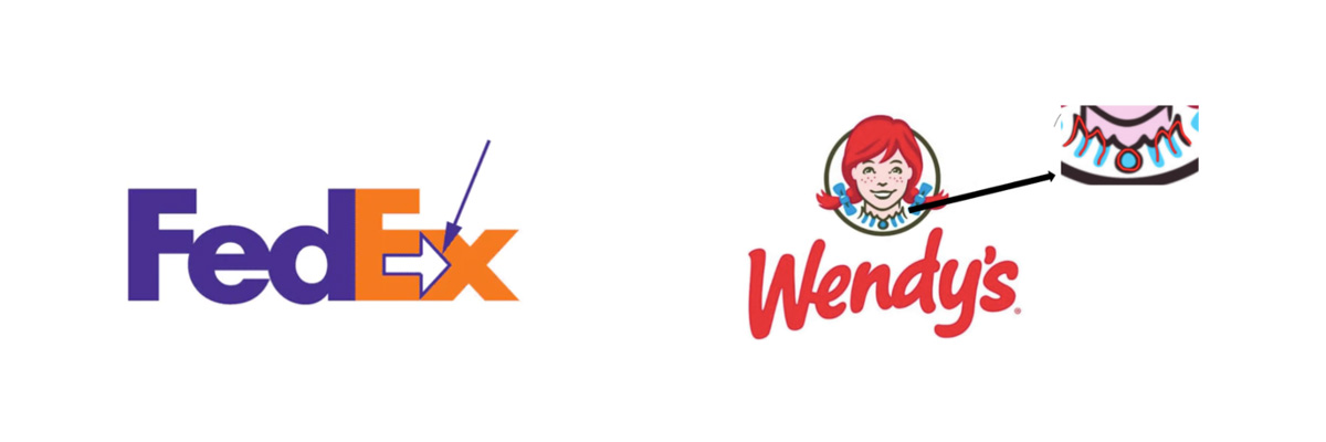
Finally, my biggest piece of advice is to not make such a big deal out of this. Don’t demand some purpose or meaning for every line, color and shape. Don’t get hung up on what it all stands for, what it all means. It’s really just a logo. I mean bonus if you get that cool symbolism in there like the arrow in FedEx or the MOM in Wendy’s, but don’t hurt yourself.

About 90% of the logos chosen are just because someone really likes the way it looks, the way it feels to them and how it jives with their company. And if you get sick of it, what the hell, change it again. I think my company has had at least five versions.
Like I said, this is my process. I’m sure other designers out there do it differently. Everyone has their own process, especially when it comes to art. This one works for me and hopefully it helps you.
 About The Author
Travis arrived at ABC back in 1995, when photography was his main creative outlet. That passion evolved over the next decade as Travis began thinking beyond imagery and pitching his broader ideas and strategies to clients. It was the birth of the idea-based marketing philosophy: Getting to know the client inside out, learning about the successes and failures, then spinning that into an idea that could build a better outcome. That’s the cornerstone he’s built his creative-first agency on since buying the place in 2005. ABC has grown exponentially since then both in terms of people and clients. Local, regional, national, banking, destinations, nonprofits: Travis has greatly expanded services over the years to accommodate them all. He’s also assembled a talented team. Just like them, he’s greeted each morning by a simple reminder etched on the wall: “Create Cool Sh!t Today!” He’s proud to run the kind of agency that does.