 •
•
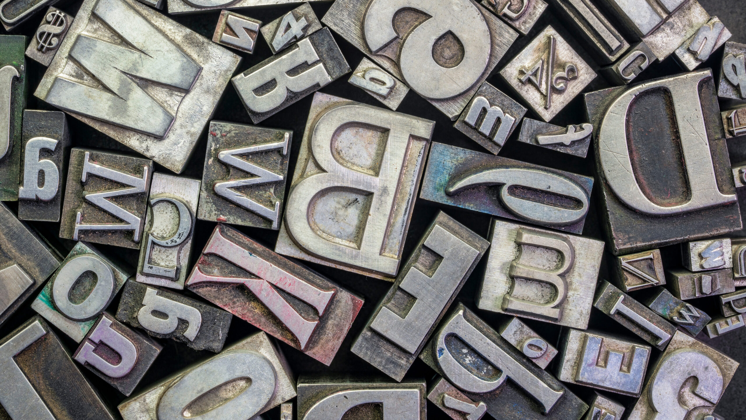
As you’re developing your brand, whether crafting a logo or laying out written materials, you’ll eventually have to deal with fonts. But there are so many, and they don’t really matter all that much anyway, right?
It seems easy to just pick Comic Sans and call it a day, but you’d be doing yourself a disservice. Typography and font choice are essential elements of effective design and written communication. They may seem like tiny details, but they can pack a punch if used appropriately. To be blunt, the font you choose can be the difference between a bland, boring message that people ignore, and a message that grabs attention.
To start off, there is indeed a difference between typefaces and fonts, though they are often confused or used interchangeably. A typeface is a set of letters, numbers and other characters in a particular design and includes multiple weights, styles and variations. A font, on the other hand, is a particular size, weight, and style of a typeface chosen for a specific use case. For example, Roboto is a typeface, and 12-point Roboto bold is a font.
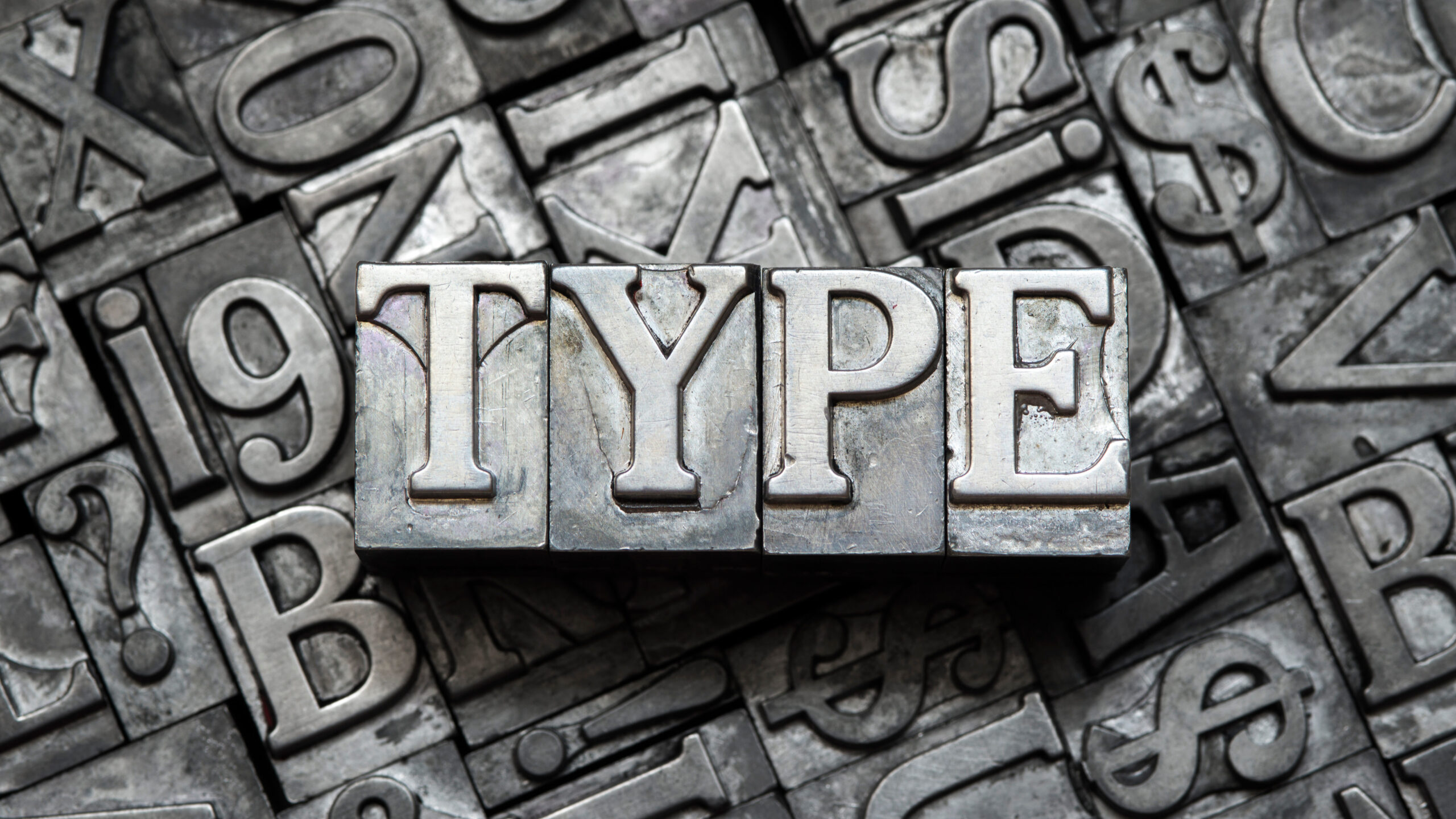
Typography refers to the art and technique of arranging type to make written language legible, readable and appealing when displayed. It involves choosing typefaces, point sizes, line lengths, line spacing, and letter spacing, along with other design elements, to create a visually engaging and effective message.
Typography refers to the art and technique of arranging type to make written language legible, readable, and appealing when displayed.
So with the basics out of the way, why do typography and font choice matter so much? There are a lot of reasons to dedicate time to these elements of your brand. Different typefaces have varying characteristics such as letter spacing, line height and stroke thickness, which can affect how comfortable they are to read. A great lettering choice goes a long way toward making your message readable and easy to understand. If your font is too small, too elaborate or too cramped, your audience is going to have a hard time reading your message.
But that’s not all. Typography and font choice can also help create a hierarchy. By using different font styles, sizes and weights, you can emphasize important points and guide your audience’s eyes through text. This keeps them engaged and focused on what really matters.
Typography also plays an important role in branding and identity. Consistent typography across all your materials can help to create a strong brand image and strengthen your messaging.
For example, the font you choose for your logo can have a significant impact on its recognition and memorability. In the same way, the choice of font for body copy can help to reinforce the tone of voice and personality of your brand.
Don’t forget to consider how typefaces can give off different vibes and moods, which can influence how people feel about your brand. For example, a fancy serif typeface can give off an old-school, classic feel, while a modern sans-serif can seem sleeker and more contemporary.
Typography also plays an important role in branding and identity.
It’s not all about style, though. Typography can also affect the credibility and authority of your message. If you choose a cheap or unprofessional-looking font, people might not take you seriously. But if you choose a font that’s well-designed and appropriate for your content, you can enhance your credibility and make your message more trustworthy and impactful.
So, how do you choose the right typography and font for your message? First, think about the mood and message you want to get across. Are you going for a modern, edgy vibe, or do you want to convey a sense of tradition and respectability? Next, think about your audience and what will appeal to them. Finally, consider the practicalities of readability, consistency, and accessibility. Realize that the medium in which your logo or message is displayed matters too; for example, a font that looks great on a computer screen may not be as effective in print, and vice versa.
Think about the mood and message you want to get across. Next, think about your audience and what will appeal to them.
Ultimately, typography and font should be based on the specific needs of the design or communication. There is no one-size-fits-all approach here, and different fonts and use of type may be better for certain contexts. They can have a big impact on how your message is received and remembered; by making smart type choices, you can create a message that’s engaging, effective and attractive. Take the time to carefully consider your options and make the right choice for your audience.
About The Author
Sean brings a true passion for all things design to ABC. He elevates his expertise in typography, color and texture in every piece he creates for clients.
He has a varied background that has earned him managerial and senior status in previous positions. As a member of the ABC team, the Rochester Institute of Technology grad is our go-to for projects of all kinds and sizes as we entrust his expert eye with everything from print pieces to digital design.
Sean was drawn to working with a close, collaborative group of people that are passionate and full of great ideas when he decided to join ABC.