 •
•
As a creative agency, we’re surrounded by principles and guidelines about color, fonts, layouts – the works. They help create solid, pleasing designs. But, some of the most memorable ads happen when rules get tossed out the window. In the right contexts, defying conventions can grab attention, communicate more effectively and push creativity into exciting new directions.
But how do you know when it’s appropriate to break the rules? And what strategies work best for bending design norms without going too far? To walk the line between innovation and insanity, check out these examples of companies who went against expectations and achieved great success by doing so.
Dollar Shave Club’s Viral Launch
When Dollar Shave Club burst onto the scene in 2012, they established their brand with an outrageous viral video that got viewers laughing. The highly nontraditional launch ad parodied the overly-serious tone and emphasis on technology common in men’s razor commercials, instead opting for the simple, memorable tagline: “Our blades are f***ing great.” Starring DSC’s founder Michael Dubin, who also wrote and produced the video, the spot’s blunt voiceover, use of humor and low-budget production aesthetics all broke branding and advertising standards. It was shot in a day for about $4,500 dollars.
But, the unpolished and raw feel worked perfectly for DSC, aligning with their positioning as a direct-to-consumer disruptor brand. Their newly-launched website crashed almost immediately, and the rule-breaking video has now been viewed over 28 million times on YouTube. They’ve stayed consistent with their messaging and absurd style over the years, and while no video they’ve produced has been quite as successful as the first, DSC was bought by Unilever in 2016 for a reported $1 billion in cash – they must be doing something right!
Volkswagen Beetle’s Counterintuitive Campaign
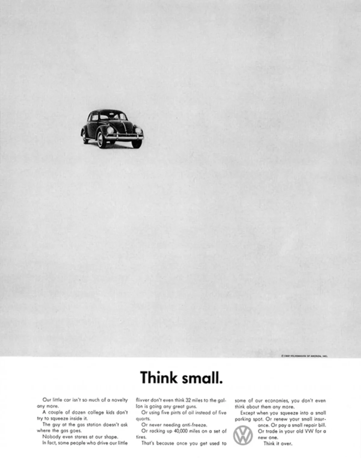
In 1959, Volkswagen Beetle’s “Think Small” ad took an unconventional approach in sharp contrast to the overblown American auto ads of the era. Art-directed by Helmut Krone and written by Julian Koenig for the Doyle Dane Bernbach agency, the stark design and funny, self-deprecating copy openly acknowledged the Beetle as tiny compared to typical U.S. cars.
The small, off-center car and ample white space reinforced the messages of simplicity and minimalism and gave the ad a quirky, off-kilter feel. Even choices like using a sans-serif font when serifs were common, dropping the logo disruptively into the body copy, and printing in black and white when full color was widely used helped the ad stand out. And let’s not forget the arrangement of the body copy itself: it’s full of widows and orphans (lines of text that dangle at the beginning and at the end of a block of text), which are typically frowned upon in design.
This was intentional on the designer’s part, as it helped make the writing feel more natural and honest. A follow-up ad, “Lemon,” dared to proudly showcase mechanical failures and imperfections, spinning a unique message that emphasized VW’s high standards and rigorous inspections. Volkswagen’s restraint and honesty came across as refreshing compared to its contemporaries. This campaign is widely considered to be one of the classics; it was voted the No. 1 campaign of all time in Ad Age‘s 1999 The Century of Advertising, and “Lemon” even appeared in an episode of Mad Men.

BK’s Absurd Interactive Chicken
2004’s “Subservient Chicken” website from Burger King is an odd one. Created for Crispin Porter + Bogusky by The Barbarian Group, this strange website allowed visitors to control a person dressed in a full chicken costume through a grainy video interface and make them perform absurd stunts and actions on command. The chicken could respond to over 300 commands, including dance moves, yoga and air guitar, among other things. It was an early example of interactive digital marketing, and the creepy, but compelling viral website allowed Burger King to generate buzz online in the early social media era.
While bizarre, the interactive chicken aligned with Burger King’s offbeat brand voice. The risk paid off, with “Subservient Chicken” achieving over a billion views according to Ad Age. The chicken has even been resurrected in years past, reappearing in the style of missing persons bulletins in 2014. This campaign demonstrated how sometimes embracing the avant-garde and bucking tradition can make for amazing results, and I personally remember sharing the site with friends and playing with it for hours, testing out all the possible commands.
As these examples show, there’s absolutely a case to be made for throwing out the rule book sometimes. Just keep in mind that rule-breaking should align with your overall positioning and goals.
When executed well, defying norms should feel purposeful, not haphazard. Don’t ignore the appeal of an occasional surprise one-off piece that challenges expectations. They can work really well if you’re an established brand! And lastly, know when to embrace imperfection and rawness over polish, especially if positioning your brand as a disruptor or challenger voice.
Rules exist for good reason, but so does the urge to push the limits. Know when to ditch conventions for memorably bold work. Think outside the box, but keep strategy inside it!
 About The Author
Sean brings a true passion for all things design to ABC. He elevates his expertise in typography, color and texture in every piece he creates for clients.
He has a varied background that has earned him managerial and senior status in previous positions. As a member of the ABC team, the Rochester Institute of Technology grad is our go-to for projects of all kinds and sizes as we entrust his expert eye with everything from print pieces to digital design.
Sean was drawn to working with a close, collaborative group of people that are passionate and full of great ideas when he decided to join ABC.