 •
•
So, we have a new logo. Why? Because we get tired of things quickly around here.
Some people move furniture around; some people change the color of their hair. At ABC, we design new stuff.
If you are a client, friend, family member or maybe just a fan, you probably also heard we moved. After 15 years in the same building in downtown Syracuse (we did move once from the second floor to the fourth), we decided to move across town to the Armory Square district of downtown.
With a new move, a new year and a new attitude, we asked ourselves: Why not a new logo?

There are a few of you out there that may also know the evolution of this company. If you do not, I would be willing to take you out for a beer and tell you the rather long, weird and possibly boring tale.
I bring this up because I must preface this logo explanation with a statement that this company was not named by me. Let’s just say I inherited the name and after much thought, I felt at the time that the name had enough recognition that I would not change it even though I am aware that ABC Creative Group is well, just not that creative.
I also tell you this small tidbit because I want you to know that developing a cool logo for the letters ABC kind of sucks. Kudos to my seasoned and creative graphic designers for their perseverance on this one.
Thirty-two – maybe even 33 – initial designs were reviewed. There was a lot of fonts, a lot of lines and shapes and a lot of eye rolling and arguing.
Then something began to emerge.
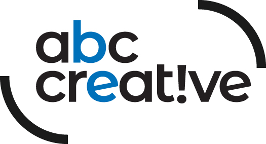
The simpler, the better, but I see something else. Our color is blue – always has been, always will be – so no questions there. We tied that in with the b and the e that kind of come together on this one.
Remember all of those things we developed where we are always telling people to “be creative”? It’s a simple, yet to-the-point mantra, if you will.
We decided to call out those letters and now we see that mantra in the logo. Yes, that’s it: Be creative!
It’s what we tell ourselves and, even more importantly, it’s what we tell our clients.
We even warn them before we start to work with them that if they do not want our strange blend of strategy always led by the creative process, then maybe we are not a good fit. Our tagline is “idea-based” and that is how we handle every project – idea first, creative first.
The lines? Well, they just frame it. They keep the creative nice and secure, but definitely not in a box. I really hate putting things in a box.
And where is the group? Yes, technically our official name is ABC Creative Group, but, quite honestly, most of our friends and clients just call us ABC Creative, so why complicate things? The simpler, the better, right?
The “creative” is more important than the “group” and we consider ourselves more of a dysfunctional family than a group anyway.
I almost forgot the exclamation point. It’s really just an upside-down I. That just looked cool. And, hey, why not, everyone loves exclamation points!!!
 About The Author
Travis arrived at ABC back in 1995, when photography was his main creative outlet. That passion evolved over the next decade as Travis began thinking beyond imagery and pitching his broader ideas and strategies to clients. It was the birth of the idea-based marketing philosophy: Getting to know the client inside out, learning about the successes and failures, then spinning that into an idea that could build a better outcome. That’s the cornerstone he’s built his creative-first agency on since buying the place in 2005. ABC has grown exponentially since then both in terms of people and clients. Local, regional, national, banking, destinations, nonprofits: Travis has greatly expanded services over the years to accommodate them all. He’s also assembled a talented team. Just like them, he’s greeted each morning by a simple reminder etched on the wall: “Create Cool Sh!t Today!” He’s proud to run the kind of agency that does.